Backgrounds
This past week I have been refining the background which will be the basis of my whole maze. Observe:
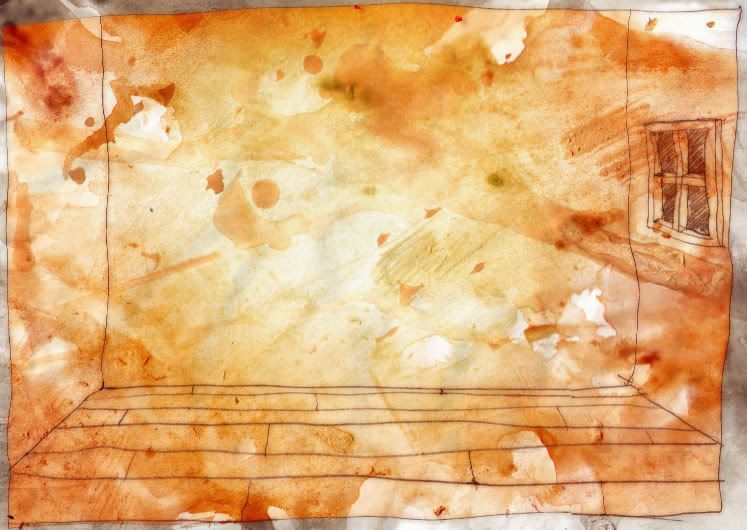
This took heaps of work and I found my self coming back to it many times over the past week with having new ideas on how to change and improve it. The background is a very important piece for my website which is why I’ve been coming back to it so many times. One important decision I had to make on this image was the colour. I felt I had two main options but I still tried many other colors in its creation just to be sure I wasn’t missing anything. As you can see here:

These were some colour combinations. The two main choices were either red-brown or blue. Blue because it is my favorite colour and has been since before I can remember. I try to buy accessories in blue, stationary in blue, clothes in blue – I even want a blue car. I did my personal portfolio website in blue – so this colour definitely describes me but for the overall composition of my maze this colour wasn’t really working too well. I even thought of having no colour in my maze except for in my three images which describe me as it would make these images stand out more prominently when the user finds them. However again, this didn’t work with the composition not the colour of my dangling light bulbs Hence, I decided to go for the red-brown colour combination.
I feel that not only does the red-brown version bring a subtle warmth into my maze (which I feel relates to me) it helps make my light bulbs look more illuminating. Also, I feel reminded even more of tea when I see the image and tea is something which inspires me.
Another aspect of the background is the line work. Personally, I’m very proud with how this part turned out. I like the texture and rough/messy-ness of the lines and how eventhough they look quite random, they all join up together quite nicely. I’ve also used photoshop to make the line work appear as though it were slightly bleeding into the tea-stain background really nicely.
To make the line work I extracted it from what I had drawn earlier and scanned into the computer and played around with the gamma, hue and saturation levels until I found the right colour. Next I made two copies of this and blurred the layer underneath and made that transparent. Finally I merged the two together and stuck them on top of the tearstain background then converted the image to a .png file to use in Director.
I’m very happy with the overall simplicity and juvenile-ness of the image. I feel that this partially describes part of me as I like (and best understand) things simplified and also like to not act my age most of the time ;P.
No comments:
Post a Comment